Responsive Web Redesign
Daniel Gestri
Team Members:
Hannah Cocanour
Madeline Rice
Hannah Cocanour
Madeline Rice
Software Used:
Figma
Miro
Invision
Virtual Studio Code
Github
Trello
Figma
Miro
Invision
Virtual Studio Code
Github
Trello
Clickable Prototype Demonstration
(Figma)
(Figma)

Design Process:
definition & Ideation
definition & Ideation
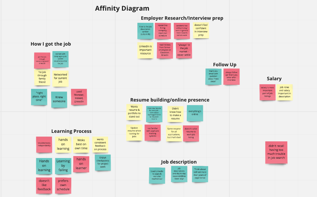
In preparation for this project, we conducted a series of interviews to better understand what resources and features are most important for young people looking for their first job. The results from that survey have been copied into cards and organized by content.
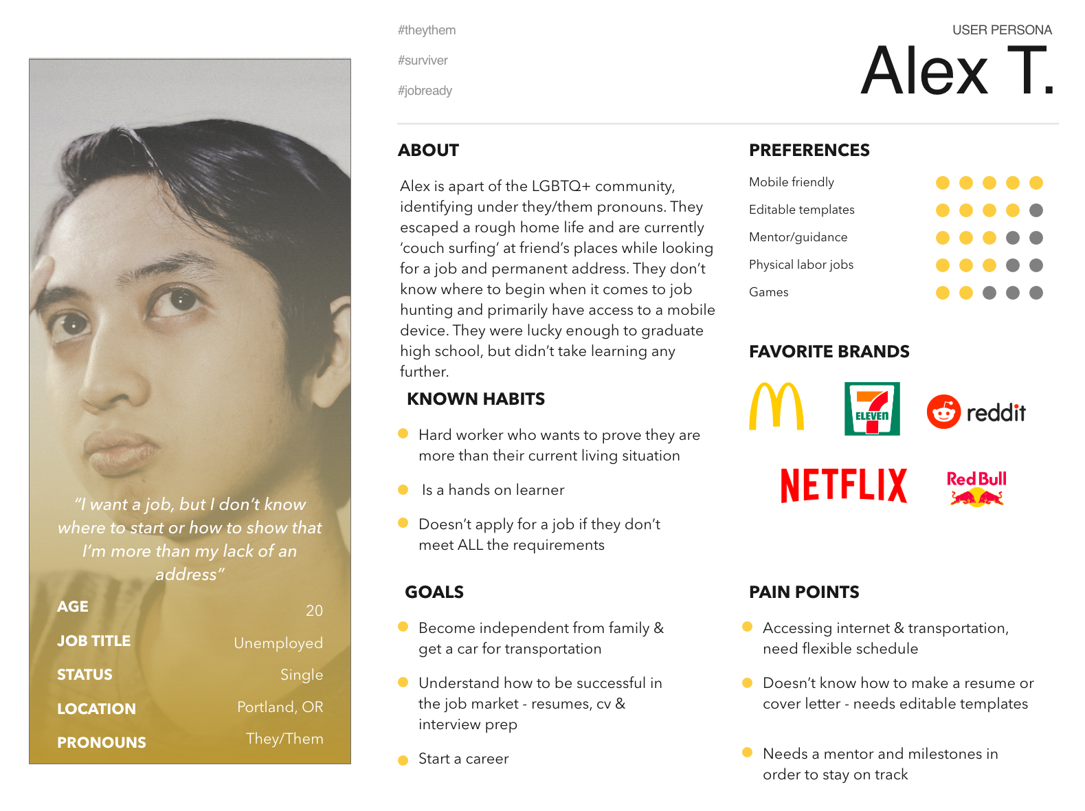
We then distilled this research into a hypothetical user persona.
DESIGN PROCESS: INFORMATION ARCHITECTURE
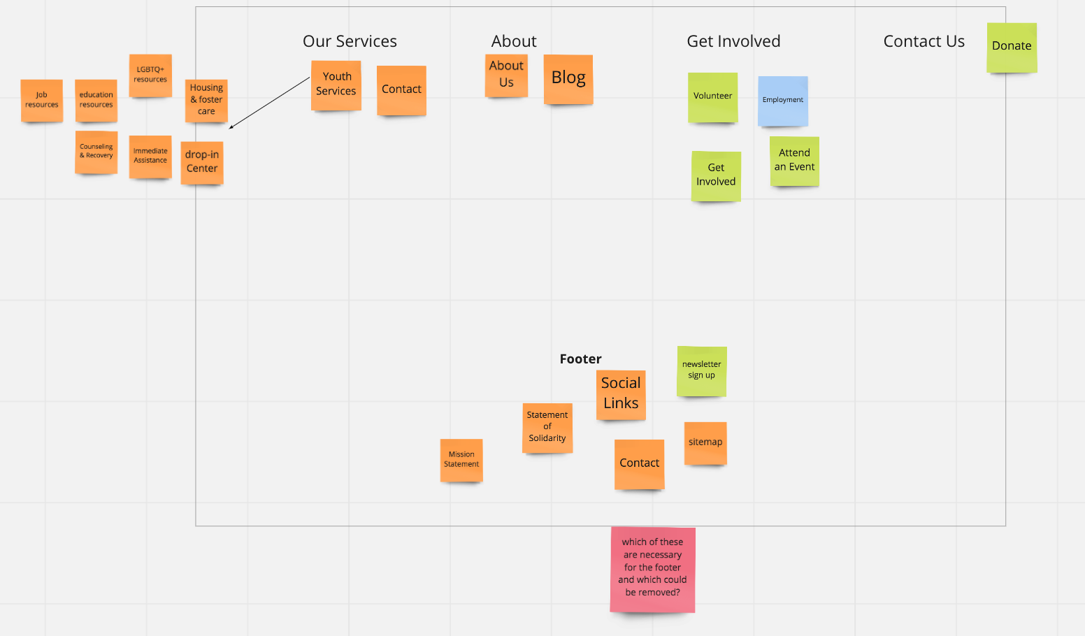
At this point, we evaluated the current website layout and reorganized the site contents using card sorting.
The content of these cards then becomes the basis for the site map.

DESIGN PROCESS:
PROTOTYPING
PROTOTYPING
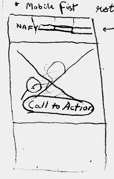

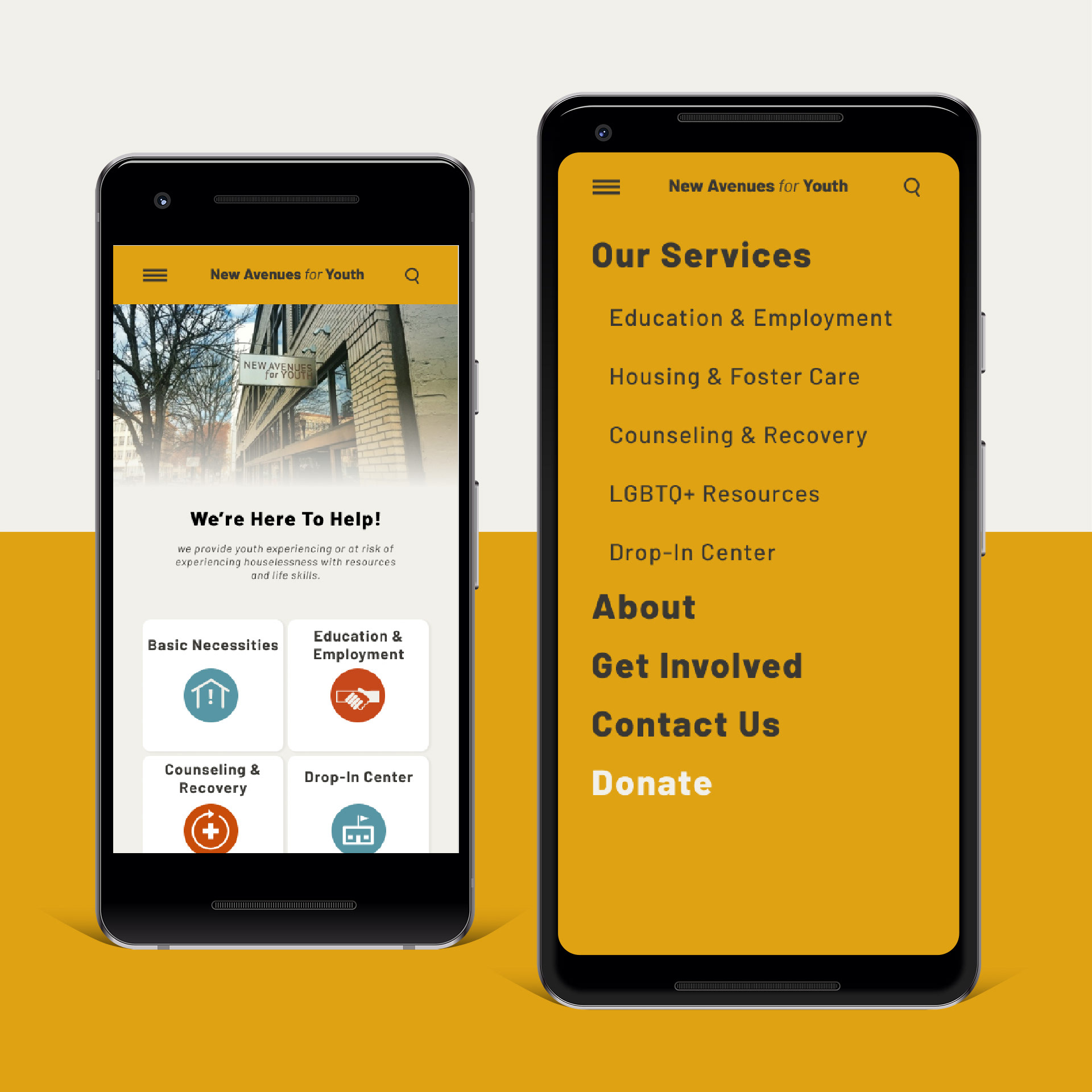
We started with hand drawn screen wireframes and iterated these into grayscale wireframes.
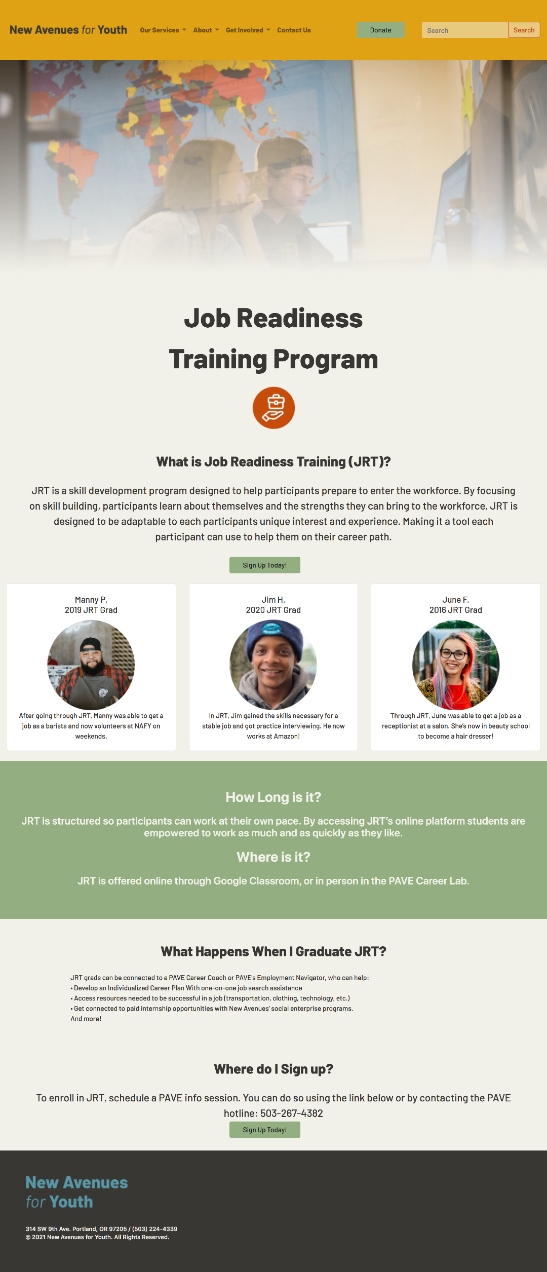
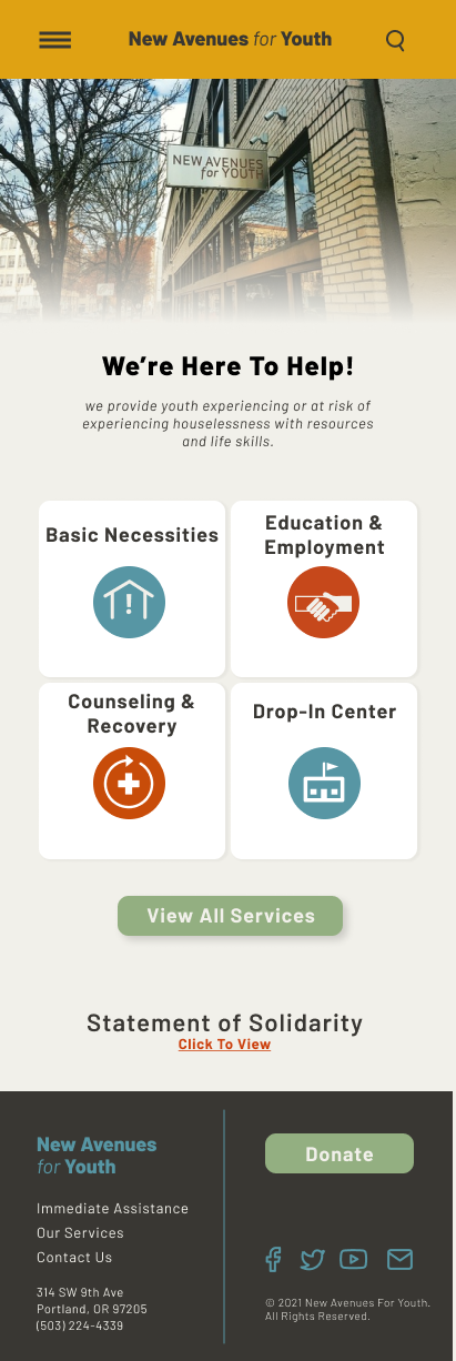
After performing tests with the clickable wireframes in Figma, we rebuilt it with the high fidelity assets you see on the right.
After performing tests with the clickable wireframes in Figma, we rebuilt it with the high fidelity assets you see on the right.
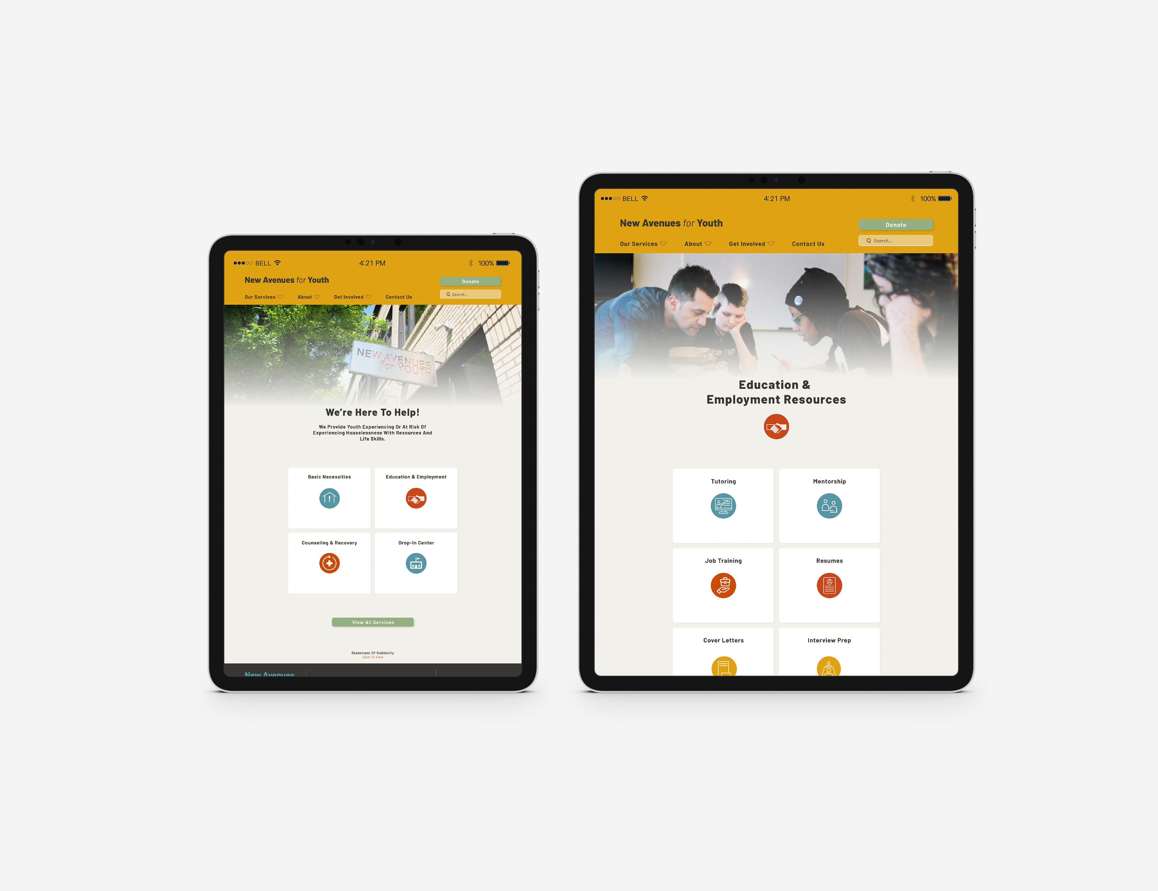
Although our research identified mobile phones as the most common device used to access New Avenues for Youth's website, the site is fully responsive, and optimized for tablet and desktop use as well as mobile use.
We even took a swing at coding these pages into a site than can easily be hosted. This was done using a combination of HTML coding and customizing pre built elements from Bootstrap. This page is hosted on Github here: